Sometimes things are too obvious but don’t work the way we think.
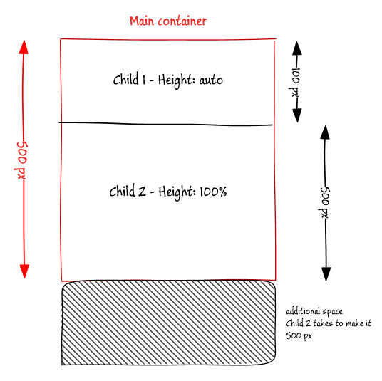
This is the HTML I have, my requirement is child1 height will be auto(based on the content) and child2 will occupy the remaining height of the main-container.
1 | <div class="main-container"> |
First I thought this is easy and created the following styles
1 | .main-container { |
This produces a wrong result - if child1 takes 100px and I expected child2 to be 400px, but the child2 height is 500px.
Let’s see how to solve this problem.
Using Flexbox
Very easy to solve this using flexbox (display:flex), most of the latest browsers supports it. Make container a Flexbox with the direction set to column, then allow child2 to grow using flex-grow:1. This ensure second child height is automatically adjusted.
1 | .container { |
Here is the result using flexbox
Using table-row
Another option is to use display:table-row. The below code shows how to use it.
1 | .main-container { |
see this in action below
